#3677 closed enhancement (fixed)
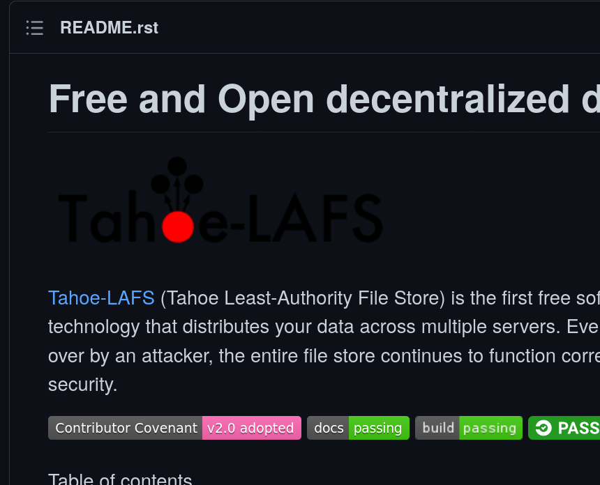
Tahoe logo looks bad on dark background
| Reported by: | meejah | Owned by: | anxhelo |
|---|---|---|---|
| Priority: | normal | Milestone: | New Landing Page and Asset Management |
| Component: | documentation | Version: | n/a |
| Keywords: | Cc: | ||
| Launchpad Bug: |
Description (last modified by meejah)
The logo we're using in the README doesn't look good on a dark background. Here's what I see with GitHub?'s "dark" theme:
Attachments (3)
Change History (12)
Changed at 2021-04-14T20:50:01Z by meejah
comment:1 Changed at 2021-04-14T20:51:36Z by meejah
- Description modified (diff)
comment:2 Changed at 2021-04-15T06:30:58Z by maylee
- Owner set to maylee
comment:3 Changed at 2021-05-02T13:00:57Z by maylee
- Milestone changed from 2021 Documentation Goals to User Documentation Goals
Milestone renamed
comment:4 Changed at 2021-05-02T18:44:08Z by maylee
- Milestone changed from User Documentation Goals to New Landing Page and Asset Management
comment:5 Changed at 2021-05-27T08:06:36Z by anxhelo
- Owner changed from maylee to anxhelo
comment:6 Changed at 2021-05-27T08:27:13Z by anxhelo
I added a white stroke to the current Tahoe-LAFS logo in repo, which makes it visible when one is using the dark/dimmed Github theme, without having to use different images or an SVG.
comment:7 Changed at 2021-05-27T08:34:45Z by anxhelo
Pull request opened: https://github.com/tahoe-lafs/tahoe-lafs/pull/1070
comment:8 Changed at 2021-05-27T14:42:55Z by Anxhelo Lushka <anxhelo1995@…>
- Resolution set to fixed
- Status changed from new to closed
In bfca424/trunk:
comment:9 Changed at 2021-05-27T14:42:55Z by GitHub <noreply@…>
In c9d5b1f/trunk:
Note: See
TracTickets for help on using
tickets.


screenshot of README on GitHub? with dark theme